When I first launched Visual Swirl two months ago, I wasn’t sure if this whole blogging thing would stick. Luckily I’ve had some great success over the first 60 days (thanks mostly to you all) and I decided that a custom look was needed to really take the Swirl to the next level. That’s why, I’m excited to announce a new look (as you can see) for the blog. Let me quickly walk you through a few of the highlights.
Clean Grunge
I describe the overall feel of the site as clean grunge. I wanted to incorporate an easy-to-read format but with a little grunge flavor. Elements of roughness exist in the background image and footer images while clean edges rule the rest of the page.
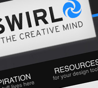
New Logo
I felt I had a decent logo when I first launched but the color scheme felt a little out of place for the original template I was using. So I update the colors and the type for the Visual Swirl logo. Being that blue is my favorite color, it felt like a natural way to go. The font of choice is Interstate and I think it gives a very clean and professional touch to the site.
Navigation and Categories
I also felt that a restructure of the navigation would be helpful. My previous category structure was getting out of hand and I decided to simplify the choices to make it easier for users to find exactly what they’re looking for. If you miss the old categories (photoshop, typography, etc), I’ve utilized tagging features to maintain some of the searchability. Check out the footer for all of the tag breakdown.
Useful Footer
Speaking of the footer, I’ve joined the club and made an informative footer a part of the design. I slapped my ugly mug on there and also added a few other relevant items. I’ll be updating this section more over the coming weeks as I add content and functionality to the site.
What’s to come
While the redesign officially launches today, I will be tweaking my design over the coming weeks. I hope to add some functionality in the form of a user news feed and some other cool footer add-ons. If you have anything that you would like to see added to the site, please let me know.
I hope you like it
I’m really excited about the new look but I want to hear what you think (good or bad). This site is ultimately about you and I am always up for your input. Let me know if anything looks out of place or if there is something that I can add to make the site even better. Thanks for stopping by and in case you didn’t even know that I had redesigned, here’s a little before/after.
Before

After


Awesome work Chris! A huge improvement
I do have a few suggestions if ya don’t mind. I think the top nav should be sans serif. I just feel there is too much variation of serif and sans serif type going on up there.
Furthermore, the headings in the sidebar, give them room to breath, increase padding top and bottom.
Apart from that Chris I love it! Great colour scheme, posts look amazing. Oh, perhaps put under the follow and subscriber count, “Follow us on Twitter” and “Subscribe to our feed”. Will match the nav and inform the reader of the option.
Great work Chris! Look forward to some excellent content
Thanks for the suggestions Liam. I appreciate you taking the time to look through and be picky. I’ve been stuck in the middle of it for so long that I need some fresh perspectives.
I hope the suggestions keep coming in so I can have version 2.0.1 ready in a couple days.
I really like the new look! I have 2 suggestions:
The first suggestion I have (and this one is personal preference) is to style the menu tab so you know which one you’re on. I know you can see the category name on the secondary pages, I just personally like to see the tab look different as well.
The second suggestion to to create a hover effect for the “Submit Comment” button.
Overall all you did a great Job on the site redesign!
I just noticed you style the nickname on comments to capitalizing the first letter. Some of us use lowercase for a reason or preference. This is a small thing though…
It’s those little details like the hover effect that you sometimes forget at first glance. Thanks for your suggestions.
Love the new look! Overall a very refreshing update and style – I’m a big fan of the ‘clean grunge’. I think the minimal color scheme really helps the articles and their related images pop.
The only thing throwing me off at first glance is the top navigation, which someone previously touched on. I’m not sure if it’s the sans serif or the italicized type, but something just feels a little forced.
Congrats on achieving a successful redesign. I’m sure it was a time consuming process but I think the result is definitely worth the effort you put in. Can’t wait to see what else you bring us!
Thanks for your comments Emma. I’ll get to working on the navigation. Can’t wait to put up your latest calendar work!
Hi Chris,
Before I start to be choosy and picky, let me say this. Great work! The design is only 10,000 times better than what it was earlier. As I had pointed in my first comment here.
Now being the grumpy me who like to take a pick at web design.
1) As Liam says, make the Nav links Serif. That sets a vertical motion of typographic elements and gives an elegant feel to the page.
2) Increase the sidebar heading paddings
3) The Nav Bar effect on Hover could be integrated with the Blue scheme rather than making it appear grey like the bg. Just a small touch but I am sure it would go a long way.
Now that I have said it all, a great show here!
I originally had the navigation hover to blue but it seemed to stick out a bit too much. Maybe after I tweak the typography of it, blue will look better. Thanks for your comment.
Redesign looks awesome! You did a huge work Chris! Everything looks fine. Good luck!
“Articles” is spelled wrong in the navigation.
That’s embarrassing. Quick fix though. Thanks!
Hey Chris, the new look, “looks” very good. Pretty better then the last version
keep going the good work…
José
Congrats on the re-design Chris. You did an outstanding job. Very nice attention to detail!! Keep up the good work!
Me gusta much…. Felicidades es muy bueno y limpio… eso me gusta….
I really like the changes. I think its a great improvement and I think the “Clean Grudge” feel really improves the user experience as things stand out more. I just recently did my site, and while I know its not perfect, this is definitely inspiring to take yet another look and see what changes and improvements can be made.
Nice work!
Excellent work, Chris. The redesign looks brilliant. I feel it is perfect. Some really good articles you’ve got in here.
Subscribed and will spend some time reading it. Glad that I found your blog
When I’m thinking about redesigning my blog, I shall look into some of your aspects for inspiration.
Nice Work, keep it up \m/
Wow the improvements are great!
Looks great! love the clean grunge look.
I would second that would be great for the top navigation to show which page you are on!
Nice job!
hey,
nice theme… I’m kind a new in wordpress and blogging, and want to ask you if you know or maybe if you write tutorials for people who wants to learn to make a theme this kind or smtg like that. I mean, I like your theme, I like mashable.com theme, but if a guy like me wants to learn to do one like this do yyou know any tutorials or do you write? Hope you give me an answer here or on email. thank you, Romeo
I love the color scheme and overall feel that this design gives to visitor. Typography is also a stronger point of this design.
And I’m glad you implemented well intended suggestions from designers above. That’s a huge improvement that needed to be done in order to make things smooth and neat.
But I would have to ask you one question though:
Why did you use GIF image with “repeat-y” as a background for these columns when you could just create separate divs for each column and set background colors in CSS for each of them?
It’s a way to take care of uneven columns. I guess since the post is going to be longer than the sidebar 99% of the time, I could have done it like you said but oh well. Thanks for your kind words and I’m glad you like the redesign.