Web design is pretty much a free-for-all.¬† There are no laws or web police (with the possible exception of Google) that tell you what you can and can’t do for web design.¬† There are, however, generally accepted conventions, best practices and design trends and rules. But rules are meant to be broken, right? What happens when designers step outside of standard practice and break the “rules” that so many stress to follow?
Why do we have rules
In a previous post we examined conventions in web design and looked at examples of sites using conventional patterns and techniques to make user experience and navigation more familiar and easier.  For a quick review, here are a few design conventions that are widely utilized in the web community:
- Logos appearing on the top left of websites
- Links featuring underlines and familiar color schemes (blue and purple on the majority of browsers)
- Button appearance of rounded corners, bevels, etc.
- Obvious icons for RSS, Twitter, Shopping Carts, etc.
- Right sidebar navigation for blogs
Designers use these conventions because they work. A user can navigate from site to site and understand immediately how to use and find most everything with very little explanation. They are generally a good starting point for designers as they make user-focused design decisions.¬† But to say that every designer must use every convention would lead to a lot of the same ‘ol stuff.¬† While the web would sure be easier to use, it would also be quite boring.
Innovate to Improve
For every rule there is always an exception.¬† But besides exceptions, there are other times when rules shouldn’t apply (at least in web design).¬† An article from Usability Post gives a great reason as to when design conventions should be broken:
“User interface patterns and conventions can, and should, be broken, provided one criterion is met: the new solution is better at its task than the one it replaces. Innovation by definition must introduce some new way of doing things, and it‚Äôs often impossible to do this without breaking the old norms.”
Striving for innovation and a better way of web browsing has brought about some great changes in the last decade.  Being different to be better is a perfect example of when design rules should be broken.
Be Creative
The other primary reason to break design rules is to stand out from the crowd in a creative way.¬† This can be dangerous to apply in all circumstances as many websites (especially those designed for clients) should not stand out because they are creative but rather because of the content and the user tasks required. A University website needs to be as functional as possible.¬† A restaurant’s website, while it can be pretty, must have information available to potential patrons.
On the other hand, a designer’s portfolio or a game site for kids can put standards to the side for the goals of exploration, inspiration, and amusement.
The Rule Breakers
Lets look at 15 websites that break various design conventions.¬† With each offender innovator, we’ll list purposely ignored conventions and comment on the possible intentions behind the designs.
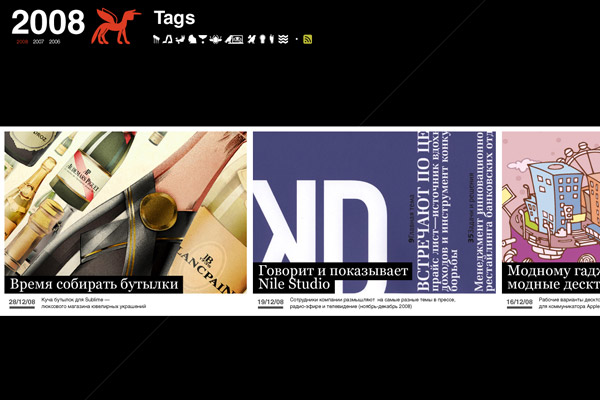
Nile Inside
Rule-breaking elements:
- Horizontal Scrolling
- Unconventional navigation
- Logo placement
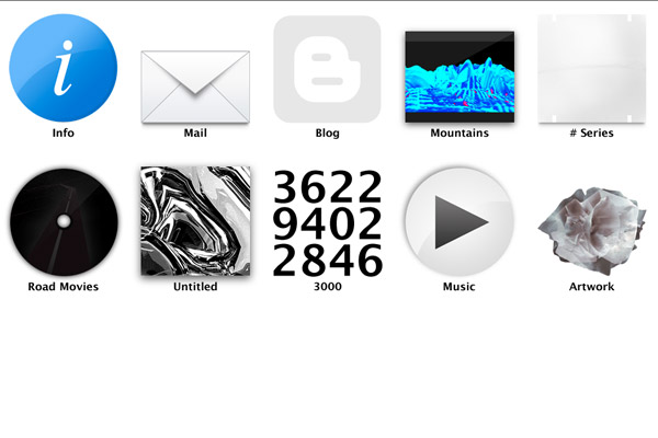
Nile Inside’s gallery is the perfect of example of when it is great to innovate.¬† Their horizontal presentation of designs will immediately catch the user’s eye.¬† Because it is a design gallery, initial impressions are important.¬† While the navigation is not crystal clear–the pictures are not dead giveaways–there is at least a large title as you scroll over each button.¬† Finally, the logo placement in the bottom right goes against the standard top-left placement, but¬† because it is a design gallery, the primary content should stay the main focus.
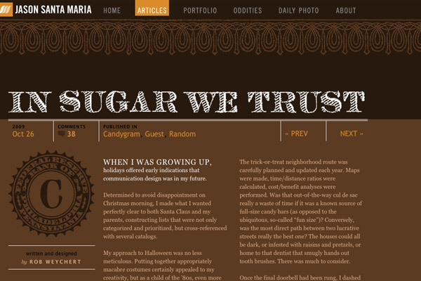
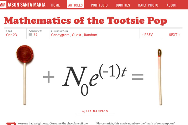
Jason Santa Maria
Rule-breaking elements:
- Unique page to page design
Jason’s work is known around the web for its excellence in quality and presentation.¬† His blog pages are a prime example one-of-a-kind designs.¬† Most websites keep a consistent feel as you browse the pages to maintain familiarity and consistency.¬† With each of Jason’s posts, he creates a completely new design.¬† The extra effort and look help his posts stand out from the crowd and give each page a unique flavor.
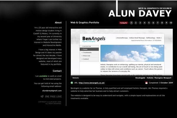
Alun Davey
Rule-breaking elements:
- Right-aligned content
There’s not a whole lot of innovation here but the right-aligned page content is often not seen in a world of centered web pages.¬† Whenever I come across a page that is aligned uniquely, I have to pause and take a second look.¬† That’s exactly how this site caught my attention in the first place.
3rdM
Rule-breaking elements:
- Images for navigation
- Unorganized navigation
Another gallery. Another innovation.¬† This time it’s a unique navigation structure.¬† As most of the content is various multimedia portfolio items, unusual navigation may be appropriate. Each large image presents somewhat of a preview of what lies on the next page.¬† The unorganized nature of the links can also quickly be ignored as users will often just pick the first item that attracts their eye.
Axel Peemoeller
Rule-breaking elements:
- Hidden content
- Experimental navigation
- Long-scroll content
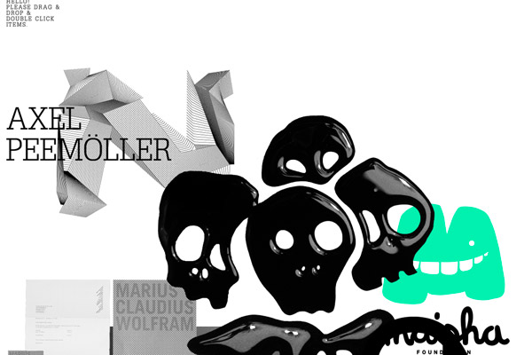
Exploration is the goal behind this free-for-all site.¬† The instructions at the top help bring sense to the madness and any user that is in the mood to explore would find great pleasure in “learning” this site.¬† I liken this to finding Easter eggs on a DVD menu.¬† Discover-ability may keep your attention long enough for you to get to know Axel and his work.
Include Digital
Rule-breaking elements:
- Content presentation and structure
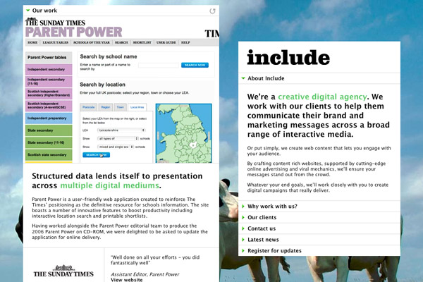
Include’s website is presented with two content areas.¬† The presentation and placement of¬† the content is truly unique.¬† Also various background images and color schemes are presented if you refresh the page. Again intrigue and unusual placement helps draw attention to the content.
Jeremy Levine
Rule-breaking elements:
- Browser size requirement
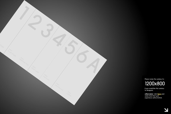
Jeremy’s use of flash in his design portfolio is great in itself.¬† What is interesting to point out is the warning that is presented if your browser size is below 1200 x 800 pixels.¬† Providing a better user experience for those on large monitors is becoming more and more acceptable as monitor sizes grow. (Although with the increased popularity in mobile browsing, large flash sites like these may be rendered ineffective.)
No One Belongs Here More Than You
Rule-breaking elements:
- Linear navigation
- Unusual sales method
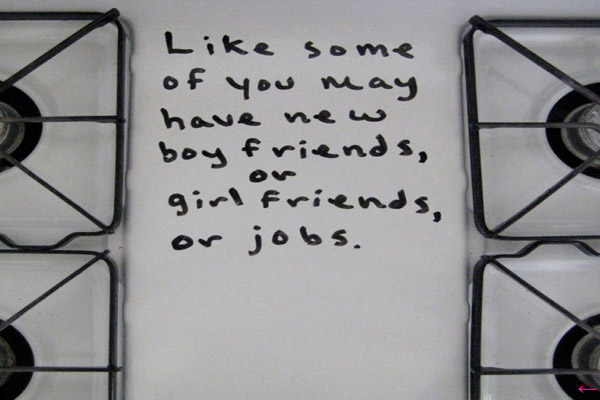
One of the most intriguing and unusual websites I’ve run across in a long time.¬† Miranda July’s book promo website takes¬† you on a journey across a stove top and a refrigerator.¬† The addictive desire to keep clicking the next button reminds me of the popular game Do Not Push the Red Button.
Links LA
Rule-breaking elements:
- Large number of font variations
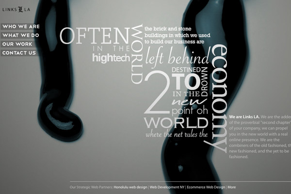
Limiting fonts to 2 or 3 has been widely accepted as a best practice for readability and consistency.  Links LA uses many fonts in winding display to create intrigue and to get the attention of the users. While it is not the easiest text to read, it does create interest and makes you pause when you visit their site.
Geo Elements Design
Rule-breaking elements:
- Large number of font variations
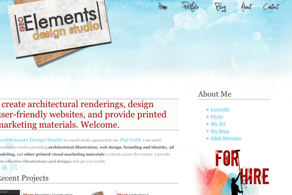
Another website featuring many unique fonts.  Because of their position on the page, each font helps to uniquely identify a certain page function or area.
Piepmatzel.de
Rule-breaking elements:
- No logo
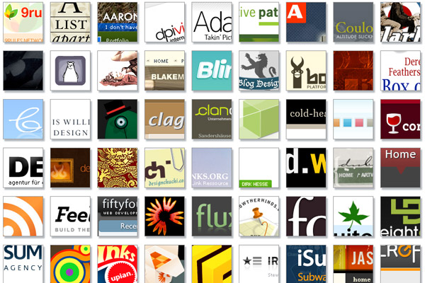
There is no attempt at identity which may be the point as this web gallery’s number one goal is to show you other great websites.¬† For anyone who’s seen a web gallery before, there are no instructions needed (so maybe this is conventional).
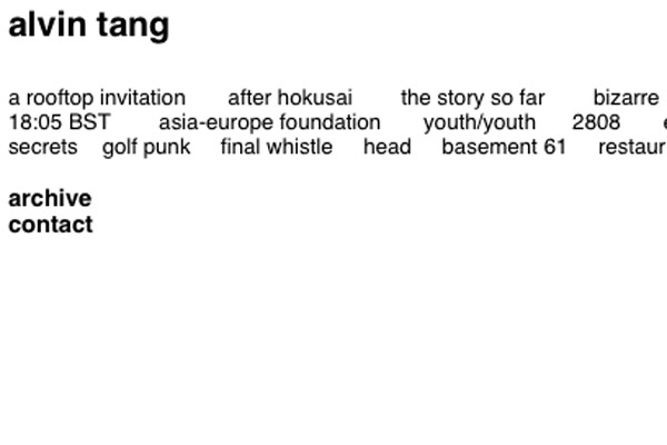
Alvin Tang
Rule-breaking elements:
- Hyperlinks without underline or color
Alvin’s gallery ignores the universal “make a button/link look like a button/link” rule.¬† But with a minimalist layout and few options, a user could quickly figure out that the text links are click-able.
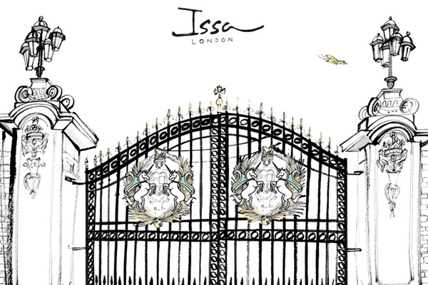
Issa London
Rule-breaking elements:
- Splash page
Splash pages are widely considered a design no-no.¬† In the case of Issa London’s website, the splash page prepares you for the experience of the main site and the fact that there is even a gate may be poking fun at the entrance notion of many splash pages.
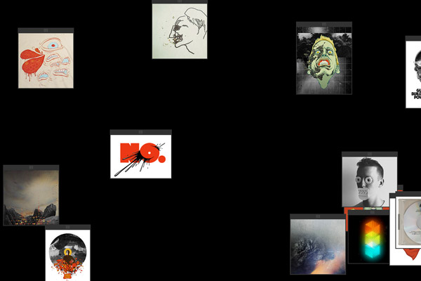
Eric Carl
Rule-breaking elements:
- Balance of content placement
The random placement of images throw off balance for this gallery site, however it does draw your eye to certain works and invites you to explore the various pieces of art.
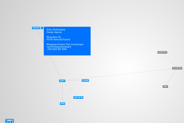
Hello Goodlooking
Rule-breaking elements:
- Logo placement
- Unique navigation
We end with one of my favorite sites that break conventions.¬† Hello Goodlooking places their logo at the bottom left to remove it from the view of the main navigation. But more importantly the main navigation is truly unconventional and simply amazing.¬† Just go play with it for a minute and tell me it isn’t down right fun to navigate.¬† A well done piece of work in itself for an innovative design company.
So When Can I Start Breaking the Rules?
The point of this post was not to get you to copy any of these designers or their innovative/rule-breaking techniques.¬† If you are out to break the rules just because you want to be different, you’ll probably see mixed results at best. With the exception of presenting a creative gallery (as seen in many of the examples above) stepping away from convention to be cute or unique can be dangerous and even damaging to your reputation as a designer.
At the same time, I hope you start to think about the rules that you follow as you design. While design conventions and usability patterns should be used–and used quite frequently–they should only be used if there is no better option. If you have a better way to present something, the choice becomes obvious.
So approach every new design with a question in mind: what is the best way to execute this element? Keep in mind the user and their tasks and if you think of a great and innovative way that will improve the user experience, GO FOR IT!  Maybe your idea will become the next great design convention.  If it fails, you can always fall back on what works for others.
Be Aware. Think.  Innovate.
Thoughts?
Want More? Subscribe and We'll Deliver it to You.

 Subscribe to the RSS feed or to email updates, to get even more great content!

