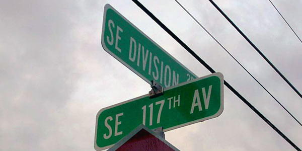
Why do we associate the color red with stop?  Why is north at the top of most maps? Why do we look to street corners for the names of the street?  We all become used to conventions that make life just plain easier.  Pick up a newspaper and you quickly understand how to navigate from page to page and where to find the important information.  The same holds true in web design. Conventions exist that designers can use to make browsing the web easy for users.
Any given user may visit dozens, if not hundreds of websites in a day.¬† Whenever a consistent practice or theme develops among those sites, it helps speed up the decision making process which leads to faster navigation and a more pleasant browsing experience.¬† Conventions help users feel more knowledgeable about their browsing capabilities because they don’t have to relearn how to use each new website.
Let’s take a look at practical web conventions that we can apply to improve user experience across the sites that we build.
Examples of Web Conventions
Layout
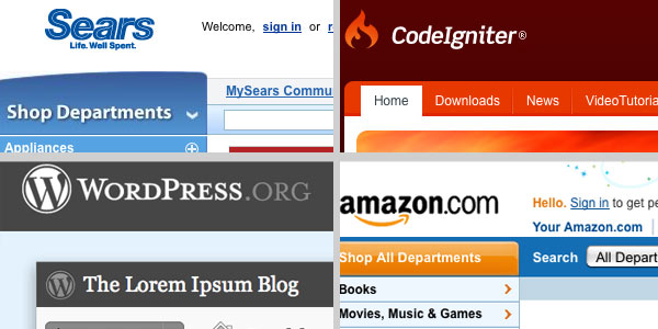
- The logos of most websites appear on the top left of the page and indicate exactly what site I am on.  Taken even further, it is common practice to make this logo a link to the home page of the site.
- Continuing down the page, convention says we need navigation of some sort (more on this in a minute) with the main content being in the middle of the page.
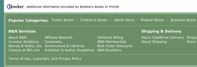
Many sites will use a sidebar on the left side of the page  for navigation and related content.  In the blog community, however, a far greater number of sites put the sidebar on the right. - At the bottom of the page we expect to find a footer with helpful links to privacy policies, copyright information, contact pages and even a sitemap.  It is also the first place to look for a link to find out who designed the site.
- One convention that is beginning to shift is the width of most web designs.  In the past, conventional wisdom was to design websites to be viewed on 800 x 600 pixel displays. Now, because the majority of users are viewing sites on larger monitors, 960 pixels or larger are becoming the norm.
Navigation
- Most primary or main navigation is organized horizontally across the top middle area of the page.
- Vertical Sidebar menus can also be used for main navigation although most sites will use this list structure for second level navigation.
- Utilities, such as links to contact pages, user accounts, and other practical options appear as small text links at the top right of most websites.
- Breadcrumb navigation (the “You Are Here” of navigation) helps users identify location on larger websites.¬† These links almost always appear directly above the main content area.
- As mentioned above, footer navigation is generally reserved for privacy and legal links, contact information, and maybe a sitemap.  Large, more useful footers are growing in popularity which will change how users may search for popular pages, social network links, and more.
- The idea of grouping links into navigation menus is a convention in itself to allow users to recognize similar tasks or link items.
Links/Buttons
- A classic link is blue text with an underline. Visited links become purple.  Many sites will alter the coloration but the underlined text is the give-away that this text is a link.
- Buttons much like links have become obvious because of their “pressable” qualities.¬† Conventional web buttons may be rounded and colored with a text-effect or bevel to indicate interaction.
- Hover states for links and buttons and the change in the pointer to a “Mickey Mouse” hand are also signs that something will happen upon a click.
Other Conventions
- Particular fonts are repeated from site to site because of their readability.  Web-safe fonts are web-safe because they have been widely adopted across operating systems.
- The magnifying glass next to an input field indicates search, even if there are no words or texts indicating ‘search’.
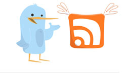
- An orange icon with white radial curves indicates where a user can view an RSS feed or a little blue bird indicates that Twitter is involved.
- Any only shopper or e-commerce user will understand the ideas of a checkout process and a shopping cart icon.
- Naming Conventions: Practically every site has a ‘Contact’ page or an ‘About’ page.¬† And users understand that ‘Home’ is the starting point for most sites.
- Even the way we organize content with Headings and bolded text indicate levels of importance that increase scanability.
Why Adopt Conventions?
Quite simply, because they work.¬† Conventions only become conventions if users find them useful.¬† If one site has success because it has decided to use a particular style of navigation, another site may pick up on this and adopt a similar style.¬† The more this happens the faster users “learn” how to maneuver from site to site. Reassuring users and providing a familiar environment to browse can go a long way in instilling confidence and trust for your brand.¬† Conventions can help convey information even if you can’t understand a single word on the page.
Warning: Break Only If You Know What You’re Doing
Many times designers stray away from conventions because they want to be unique and creative (follow up: 15 Websites that Break the Rules).¬† If that is your only reason to break convention – don’t do it.¬† The only time conventions should be avoided is if you know you have a better way of doing something.¬† If your decision produces results, it won’t be long before other sites are adopting your ideas and a new convention is born. If not,and your user finds the site hard to “learn” or they become frustrated by your unconventional approach they are always one simple convention away from leaving your site – that little red button in the corner.
Thoughts?
Have I missed any conventions? What conventions do you enjoy breaking? Let me know your thoughts in a conventional comment below.
Want More? Subscribe and We'll Deliver it to You.

 Subscribe to the RSS feed or to email updates, to get even more great content!

