


In this tutorial we’re going to put together a cool grungy poster design for the upcoming Vancouver Winter Olympics. We’ll go over several basic Photoshop techniques and combine some basic image manipulation with some grunge text treatments to create some cool effects. This is an easy step-by-step tutorial that even Photoshop beginners should have no problem with.
Final Image Preview
Let’s take a look at what we’ll be creating. Just in time for the 2010 Winter Olympics, a grunge snowboarding poster emphasizing the pressure that Olympic athletes often face: The World Will Be Watching.

Download Final Poster (897 KB .jpg)
Gathering Materials:
We need to round up a few pieces before we begin. Go out and download the following materials:
- Snowboard photo from stock.xchng
- Burnt Negatives Brush Set from Brush King
- Light Strangs Brush Set from Vibr8 Bros
- Olympic Rings Logo from Brands of the World
- Concrete Texture from Texture King‚ÅÉ
Step 1
Create a new document sized to 1280px x 1024px. Open up the snowboard photo in photoshop and drag into your new comp. Resize the photo to fit into your work area. Name the layer ‘BG.’

Step 2
Next we need to remove the snowboarder from the background. Grab the pen tool and set it to paths mode and trace around the snowboarder. A new path will be generated in the paths panel.

Step 3
Command-Click the new path from the paths panel to create a selection from the path. Copy the snowboarder and paste in a new layer. Repeat the selection process to remove the sky between the legs of the snowboarder. Rename the new layer ‘Snowboarder’.

Step 4
Next we need to get a little creative with the snowboarder. Add an Outer Glow via the layer style menu. Set the color to light blue (#06A4FF). Match the Settings in the diagram.

Apply a dry brush filter (Filter > Artistic > Dry brush). Match the settings in the diagram.


Step 5
Next we need to add the streak effects. Create a new layer called “Streaks” and open up the Light Strangs Brush Set. Select the streaky brush (the first one in the set). Bring down the brush size to around 1200px and rotate the angle to match up with the snowboarder.

Paint a few streaks using various shades of blue.  Use an eraser to clean up excess streaks around the snowboarder and outside his direct flight path.

Duplicate the layer to create more vivid streaks.

Step 6
Let’s create the sunburst in the background. On a new layer drag out the rectangular marquee tool to make a large streak down the image. Fill the rectangle with a light gray color using the fill bucket. Alt-drag this selection to create several bars across the screen (adjust the width and spacing to give some variation).

Step 7
With the layer selected, apply the Polar Coordinates Filter (Filter > Distort > Polar Coordinates). Resize and position the center behind the snowboarder. Change the Sunburst layer’s blending mode to Overlay and drop it’s opacity to 45%.

Step 8
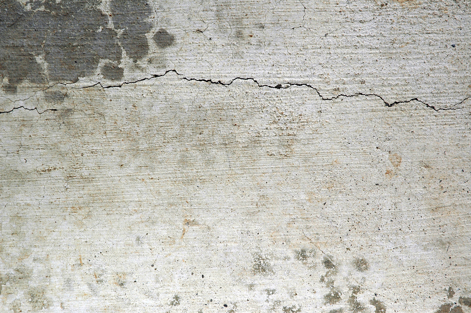
Open up Concrete Texture. Resize and rotate so that the crack is positioned where you want it. Set the layer’s blending mode to Color Burn and drag the layer immediately above the original photo (BG layer).


Step 9
Using the Shape tool, draw out two black boxes below the snowboarder for a background for the text.

Step 10
Select both layers and merge them (right click and select “merge layers”). Set the opacity of the merged layer to 80%.

Step 11
Open up the Burnt Negatives Brush Set. With the black bars layer selected, grab the eraser tool and select several brushes to rough up the edges.  You may need to rotate and resize (using the bracket keys) the brush to get your desired effect.

Step 12
Now we can begin adding our text. Using the text tool, type out “VANCOUVER” and “2010”. I’m using News Gothic Bold set to a light blue color (#33AEDF). Position the text over the boxes and resize to your preference.


Step 13
Create a new text layer and type out “THE WORLD WILL BE WATCHING” using the same font settings. Place the text at the top of the page and resize to fit the width of the poster. Decrease the leading to bring the lines closer together.

Step 14
Rasterize your type layers and using the eraser tool grab some more Burnt Negative brushes to rough up the text. Decrease the opacity of your eraser to around 80% and use the same technique we used on the text background boxes.

Step 15
Open the Olympic Rings Logo and drag it next to the main title. Apply a color overlay via the layer styles menu to match the color of the text.

Step 16
Use the Burnt Negative brushes at 80% to rough up the Olympic Logo.

Step 17
Let’s create a little more movement in the image by adding some faded versions of our snowboarder. Duplicate the Snowboarder layer twice. On the first layer, change the blending mode of the bottom snowboarder to multiply and drop the opacity to 45%. Drag and rotate the snowboarder into place.
Take the second snowboarder layer and decrease it’s opacity to 50%. Rotate and position between the other two snowboarders to achieve the look below.

Step 18
Finish up by tweaking the curves of the BG layer. With the BG layer selected, choose Image > Adjustments > Curves. Slightly modify the curves for the RGB channel to match the diagram.

We’re Done!
I hope you enjoyed this tutorial and if nothing else, I hope it got you ready for the Olympics. I was going to do a poster for curling but it just didn’t seem as exciting. Please leave your thoughts, suggestions, and questions in the comment section below.

Want More? Subscribe and We'll Deliver it to You.

 Subscribe to the RSS feed or to email updates, to get even more great content!