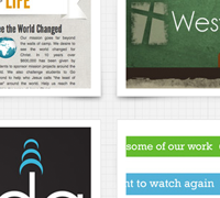
Where do you turn for inspiration for your next website design? If you’re like many, you probably head straight for a design gallery. Just fire up your browser and choose from any one of the hundreds of web design galleries available.
In an age of information overload, the design community is churning out more content than ever. Every day, hundreds of sites will go live across the globe. Many of the best will be collected, tagged, and put up for display in any number of the countless design galleries. Design blogs will round up the best of the best for catchy list posts aimed to inspire more designers to create even more websites. It can be overwhelming sometimes to wade through the endless pages of designs in these galleries. Read these tips and techniques on the right way to browse a design gallery and I’m sure you’ll find your browsing experience to be more valuable and pleasant.
Have a Plan

Before you even open your browser, make sure you know what you’re looking for. Having your eyes set on a certain element (i.e. footer design) will help make your time productive and meaningful. While it’s okay to browse just to “be inspired”, targeted browsing will help reign in your focus and will improve the learning and browsing experience. Here are a few strategies/targets:
- color schemes
- specific page elements (footers, primary navigation, buttons, etc.)
- layouts (contrast and arrangement)
- typography
- textures
You can also browse for certain “types” of websites. For instance, if you’re designing a site for an insurance company, be on the lookout for insurance sites and other related businesses.Having a good plan will ensure that you come away from your browsing experience with some targeted results and ready to use what’s inspired you.
Set a Time Limit

Many of the web galleries that I frequent have dozens and dozens of pages of designs; several of the sites are even updated daily. It can be easy to lose track of time while browsing, and setting a time limit will be helpful. There is such a thing as design overload where your senses have been stimulated beyond what they can take. Attempting to take in inspiration beyond this point may negatively affect your browsing experience.
I try to spend no more than 20-30 minutes at a time browsing a gallery. If I’ve set myself up with a goal for the browsing session, it should be no trouble to get in and get out with some great ideas in that amount of time. Now I may go back and take a closer look at sites that I’ve tagged in my browser session, but my initial look-through should be focused and constrained.
Some designers make it a habit to spend XX minutes every day browsing design galleries or other forms of inspiration. I think this is a great tactic, especially if you are willing to step out of your design comfort zone and look at designs that would be of a completely different style than what you’re used to designing.¬† Again though, be cautious to not fall into the mode of glazed-over browsing where you click for 2 hours and don’t remember a single design.
Examine and Inspect
Now that we’ve got our goals and our time limits in order, we can get to the task at hand of actually browsing the gallery. Besides the obvious of moving site by site and looking at your predetermined area of focus, there are several methods or tricks that I like to use to learn and explore.
First Impressions
This is exactly what it says it is. When you move to each new design, take count of what your first impression. What emotions does it conjure up? What elements attract your eye? What doesn’t feel right? These are just a few questions to ask after first glance.One thing I like to do is open the page up for 5-10 seconds and then close it and jot down what I remember, what I like, what I don’t like. First impressions can lead to only impressions when your dealing with the web so learning from other designs what works and what doesn’t in a matter of seconds can be extremely valuable.
Another valuable experiment is to see how quick and thorough the design explains the brand. In other words, after 5 seconds of viewing the page, how much can you tell me about the company/organization/service that you didn’t know before. Identifying trends such as bold typography in various websites can help you sell your own brand when it comes to your own designs.
Bit by Bit
![]()
The First Impressions test is great for examining the effectiveness of a site as a whole. Picking the site apart bit by bit is more appropriate when you’re looking for a particular style or element. For this exercise, use the zoom functionality of your browser and focus in on a certain piece of the design. By focusing in on a specific element, perhaps a site’s themed buttons, you can start to break apart the design and see what went into creating it from the ground up. Take special notice of designs that are perfect down to the pixel level. Many finely-crafted websites will show little intricacies that make them stand out from the crowd. Take these bits and think about what their purposes.
If you move from element to element, notice how a good designer will borrow colors, textures, and shapes from other parts of the site to bring about cohesion and balance to the overall experience. Take note of site wide trends. Using consistent elements across your design will help take your sites to another level of professionalism.
The Blur Test
A third experiment, the blur test, will take a little more work. Take a screen grab of a design you like into Photoshop and apply a slight blur to the image. You want the text and images to blur together into a mass of colors and shapes. In this exercise, it is not important to be able to read anything. What you’re looking for is more general elements: contrast, focus, layout, and color schemes. It’s amazing what perspective you’ll gain from taking designs out of focus.
An easier alternative to the Photoshop route is just squinting your eyes and blurring the sites naturally. This method is not recommended if someone is in the room with you as they may start to look at you funny or suggest you take a trip to the eye doctor.

Compare and Contrast
Another great tool I use is a side-by-side comparison of two sites that I’m interested in. I’ll open them in separate windows and look at details that are similar or methods the two designers differed on to arrive at a similar goal. This is extremely handy in finding multiple ways to achieve an effect, emotion, or layout.
Take Notes
Throughout all of your browsing, be active in taking notes. Jot down layouts that interest you. Make notes of color schemes through the use of a color picking tool. Take screen shots of certain design elements that you want to remember. The goal here is to take away from your browsing experience something that you can use in your own designs.
I keep a design notebook that has sketched-layouts, lists of things I want to incorporate in future designs, and trends that I notice in certain web industries. When I need to refer to something I saw in a design gallery, I can refer to my notes for quick access.
Bookmark the Best, Forget the Rest

In the same sense, bookmarks should also be used in every browsing session. Making notes is great but it’s also handy to have your designs stored somewhere for quick review. This can be done directly in the browser although there are a few other tools that I use that make sorting and tagging easier.
Delicious provides online tagging and bookmarking that can be accessed from any computer within reach of the Internet. Tags and notes will help you remember why you wanted to save the site in the first place.
Another tool that I use very frequently is Evernote.  Among other things, Evernote allows me to snap sections of a website and save them as tagged and filed bookmarks in a notebook. It too is accessible from multiple computers and offers a great way to keep my inspiration organized for future projects.
One last note on bookmarking. There are so many sites out there that are good, you may not need to bookmark every one. An overstocked library of web designs may seem appealing but sometimes it can be overwhelming. Take care in bookmarking with a purpose and resist the urge to save every site. If you need to, you can always return to the gallery later to track down that missing design.
The Wrong Way to Browse
I wanted to leave you with a thought about what web design galleries are not. They are NOT a stock library of designs that you can rip and reuse in your own works. It may seem easy to just do what the best do and copy their work. This is lazy and it hurts not only the designer of the original work but also your own design ability. If you’re unable to creatively produce original designs, maybe you should rethink your role in the production of websites.
I hope you’ve learned a few things about browsing web design galleries. If done correctly, with the right motive, browsing a gallery can offer you information and inspiration to make your next design stand out and impress (and maybe find its way into a design gallery itself).
A Few of My Favorites
Here are just a few of the galleries that I frequent for design inspiration and to practice some of these techniques:
How do you Browse
How do you use web galleries? Do you make it a part of your daily schedule to learn and be inspired from other designs? What tips or techniques have I missed? Please leave your thoughts, comments, questions, and snide remarks in the comments below.
Want More? Subscribe and We'll Deliver it to You.

 Subscribe to the RSS feed or to email updates, to get even more great content!


