


Not so long ago most footers were not more than a single line with a simple copyright notice and a link to the site designer. That time has passed and the footer has evolved. The current trend is creating a big, fat footer for your website. These large footers are generally stocked full with content: about, connect, subscribe, links to other articles, sitemap, back to the top link, categories list, recent comments, etc.
While some designers just went along with this trend, others did not. Why should you extend your footer? Or Why would you keep the footer short? This article explores the pros and cons of an extensive footer. Of course it matters what kind of site you own and which style you pursue. Is it a blog or portfolio site? Do you have a minimalistic style or do you go all out? Keep that in mind when reading this debate.
Pros of A Fat Footer
User-Friendliness
Suggesting other content at the end of a page makes your site a bit more user-friendly. See it through the eyes of a visitor: When I reach the end of a page, there is always the question where I’m going next. Usually I click the site away. But by providing links to other articles you can keep visitors on your site. You can also provide contact information or your social media links (Facebook, LinkedIn, etc.)

Design Was Here offers recent posts, comments and tweets offering plenty of choices for what to do next.
Boost for SEO
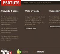
Extra content means more keywords. Google likes the extra keywords, so a plus for SEO. It isn’t much because the Google ranking for the footer tag is quite low, but all things help.
Please don’t take advantage of it. Some sites have been punished for using this technique for SEO-spam.

Viget Inspire utilizes a category listing in their footer. Categories and Tags are useful for slight SEO boosts.
Express Your Creativity
The footer is a good place to show how creative you can be. If you’re an illustrator this is a good place to show a character. If you’re a product designer – show us a product. The possibilities are only limited to your imagination.

Yo Div begins their useful footer with a creative and fun illustration that matches the feel of the site.
Cons of a Fat Footer
Slows Your Page Down
More content means that it takes longer to load the page. If it takes a visitor too long to load your site, they will click your site away. Use a program like Yslow to A-B test your footer. If the footer adds too much to your loading time, take some content out, or kill the footer as a whole.

Colorburned includes a lot of images and external links (flickr, advertisement) that may increase load time. A beautiful footer nonetheless.
Commented Out
Is it useful on a site where an article generates many comments? I usually don’t read the comments. If a visitor can’t see the footer, what’s the point in designing one? To overcome this problem you can put the suggestions for other articles first and after that the comments. Or perhaps a drop down box which opens the comments.

Smashing Magazine’s wonderful footer is usually buried below hundreds of comments.
Disconnected
Some footers are designed apart from the design of the site instead of matching the tone of the site as a whole.

While the entire design of this site is undesirable, a mismatching footer only makes it worse.

Soh Tanaka does a much better job of blending the footer with the rest of the site.
Conclusion (The Footer of this Article)
Personally I like those big, fat footers. Especially if they are well designed (like YoDiv). But that’s just my opinion, I’m curious about your thoughts. How much attention do you pay to the design of your footer and do think it’s really necessary?

Want More? Subscribe and We'll Deliver it to You.

 Subscribe to the RSS feed or to email updates, to get even more great content!