


Stunning Typography Marketing Examples
One of the most interesting visual design elements is typography. After all, this is where the message is clarified and the entire visual piece’s purpose is driven home. But even more interesting is when typography is the centerpiece. Marketing initiatives have shown us many excellent examples of typography acting as the primary focus. Even so, this can be a serious challenge. Balancing the supporting graphics with the primary typographic elements is no easy task, whether the design is for brochures or a website.
This collection of 20 examples of typography demonstrate some incredible designs that either use typography alone or the typography elements are key to the design itself. This ranges from minimalist designs to intense 3D direction. Enjoy and don’t forget to tell the authors you appreciate their work!
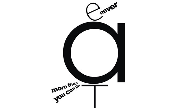
Optimum Health – Never Eat More Than You Can Lift
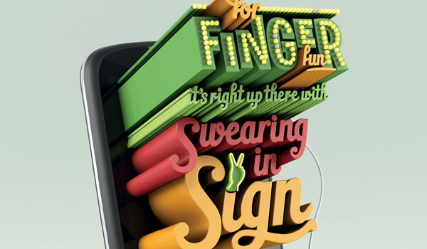
Huawei – Finger Fun
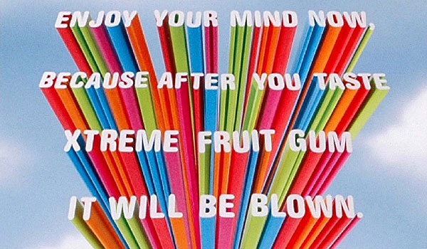
Skittles – Enjoy Your Mind Now
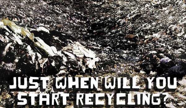
Western Riverside – Recycle
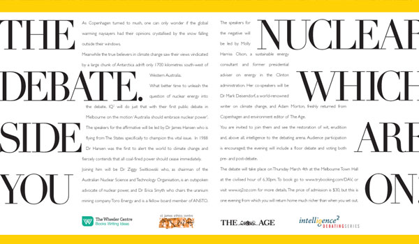
Intelligence Squared – Debate
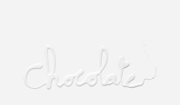
Bonux Ace – Chocolate
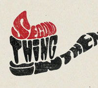
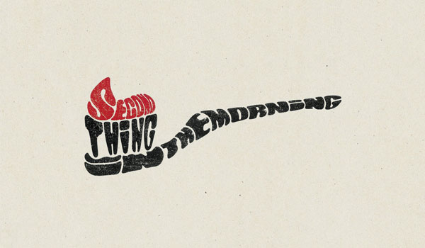
Gulf News – Second Thing in the Morning
US Preventive Medicine – Cobra

IKEA – Pimp
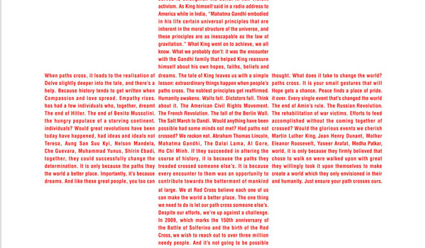
Bombay Red Cross – Martin Luther King
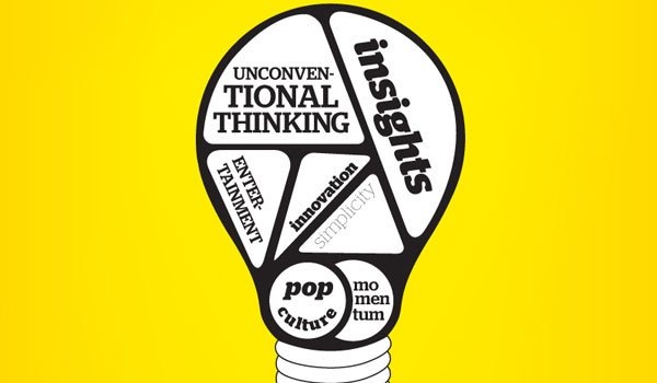
Jung von Matt – Anatomy of a Great Idea
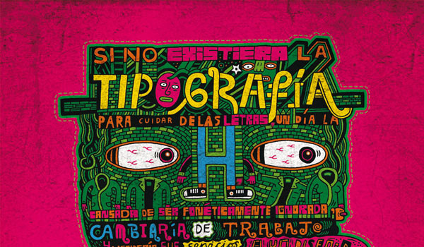
Complot Creativity School – “H”
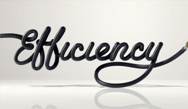
Toyota – Efficiency
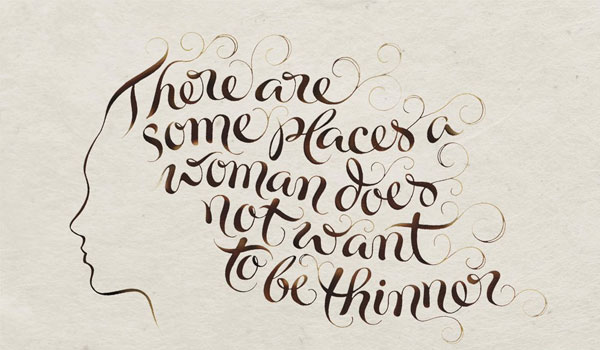
Rogaine – Thinner
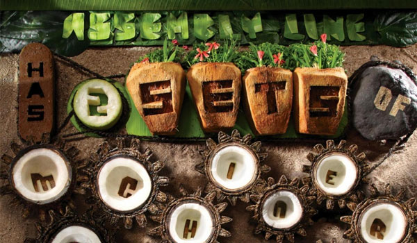
Cholayil Medimix Soap – Assembly Line
7 – Eleven – Slurpee: Summit
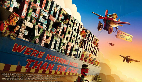
Mint Museum of Tays – Tin Toys
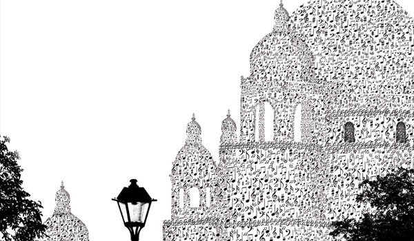
Friends 91.9 FM – Victoria
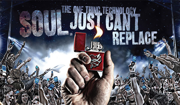
Zippo – Technology
US Preventive Medicine – Shark

So which of these designs worked? Did any of these designs fail to focus the viewer on the typographical elements with over-the-top graphics?

Want More? Subscribe and We'll Deliver it to You.

 Subscribe to the RSS feed or to email updates, to get even more great content!