


Logos last a lifetime. At least they’re supposed to, right? Most of us agree that when designing a logo, it’s best to avoid the latest trends (think corporate swoosh—bleh!) and stick with a composition that will look good in 10 years. So the question I’ve been mulling over for the past month is: Does this rule also apply to web design?
Let’s face it—websites from 10 years ago look ancient. They’re obviously outdated and old-fashioned. Since the web is such a quickly-changing field, anything we design today will probably look dated in 10 years, or even 2 years. If that’s the case, how much should we use modern trends in our web design?
This is a complicated question with many factors to consider. In my opinion, your web design should prove your relevance by using the latest trends, but the design should be usable and stay true to who you are. Here’s why.
Web design is part of your brand.
Your company’s brand (or your client’s brand) is made up of the entire customer experience, from the logo to the print collateral to the purchase experience and customer service. The website is an important part of the brand, but it’s not as foundational as the logo. The logo is the visual part of your brand that should be recognized instantly, so it really shouldn’t change from month to month or even yearly.
In contrast, your website could change every year and still be recognizable as your company and your brand, as long as the logo and other brand elements are used consistently.
But how much should a website change? Should your website (or your clients’ websites) incorporate the latest web trends or not?
Maintain basic usability.
Web design trends are constantly changing, but the basic principles of usability remain fairly constant. Some of the most successful companies today have a basic website structure that has not changed much in the past 10-15 years.
For example, Amazon’s design is very similar to what it was 11 years ago. Here are screenshots of Amazon.com from October, 1999 and March, 2010:
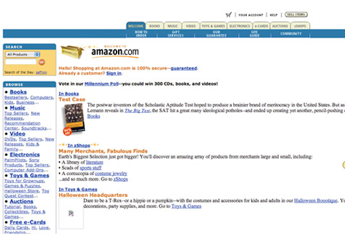
Amazon.com in 1999
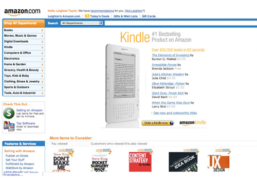
Amazon.com in 2010
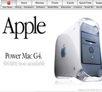
Apple has also kept a similar site structure over the years—the graphics have evolved, but the basic layout is the same: navigation across the top with large product image featured below. Here are screenshots of Apple.com from February 2000 and March 2010.

Apple.com in 2000
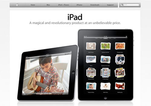
Apple.com in 2010
If you work hard to create a basic layout and information structure that is easy to navigate, you won’t have to make major changes every month or every year.
Web trends change quickly.
One current hype in web design is the “web 2.0” look. Web 2.0 is a fuzzy term, since it can refer to either the current evolution of the Internet into a more social community, or to the popular design trend using gradients, large sans-serif typography, and vector art. In this article when I talk about web 2.0, I’m referring to the design trend.
Lots of great websites make use of the web 2.0 look (Freelance Switch, Tea Round, and Lemon Stand, to name a few). Is it bad for them to be trendy by using a design that will probably be outdated in a few years? Not necessarily.
Trendy can be relevant.
For us designers, a big part of the value that we can offer clients is that we are relevant. In other words, we are valuable to our clients because we understand current technology, current markets, and how to relate to people (customers) through the latest technology in a visually-pleasing manner.
If your site looks outdated, you are communicating bad things to potential clients. Your value is diminished in their minds. When creating a website for a client, this sense of being in touch with the times is always important, but varies depending on the client’s industry.
As I mentioned before, web design is part of your brand, so your brand needs to communicate that you are in touch with your clients’ needs and know how to meet them. One way to do this is through using design trends in an appropriate way.
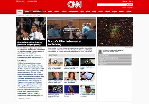
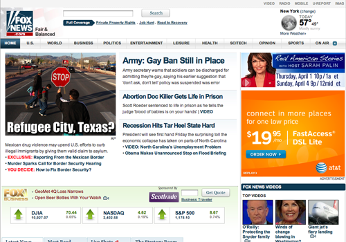
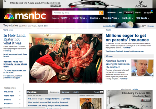
One website that has raised the bar for its competitors is CNN.com. In my opinion, CNN‚Äôs website is clean and scannable, in contrast with other major news network sites like FoxNews and MSNBC, which I think are cluttered and busy. CNN uses their classic logo while updating their site‚Äôs design to show that they are relevant and with the times, and this relevance adds value to the network‚Äôs brand. The websites of FoxNews and MSNBC aren’t terrible, but CNN’s is better.
Don’t be a follower.
Don‚Äôt let your use of trends overpower your own style, and don’t let trends dictate your brand development. Be yourself! Pick and choose how you are going to use the latest visual effects, and then let your own personality (or your client‚Äôs personality) flow through the whole design. It‚Äôs hard work to be creatively unique! It‚Äôs much easier to go with the flow, using the latest trends and failing to really create something that is YOU.
Timeless or trendy? Both!
Use the latest visual trends whenever it’s appropriate, but make sure your own brand is the foundation. Usability is much more important than using the latest trends, so first of all, create a usable site. Then apply appropriate eye candy.
There is a big difference between the philosophy of logo design and that of web design. While a logo should stand alone as a good piece of design, regardless of current trends, a website should probably be more influenced by the design culture. If you can use current trends in typography, layout, and graphics while maintaining usability and without abusing your brand, go for it!

Want More? Subscribe and We'll Deliver it to You.

 Subscribe to the RSS feed or to email updates, to get even more great content!